Southport Railway Station – exhibition descriptions
This is the dedicated page for descriptions in relation to the ‘Through Our Eyes’ exhibition at Southport Railway Station. The exhibition is situated between Platform One and Two and these descriptions are listed in order of appearance, from left to right.
Through Our Eyes – Exhibition Description Panel
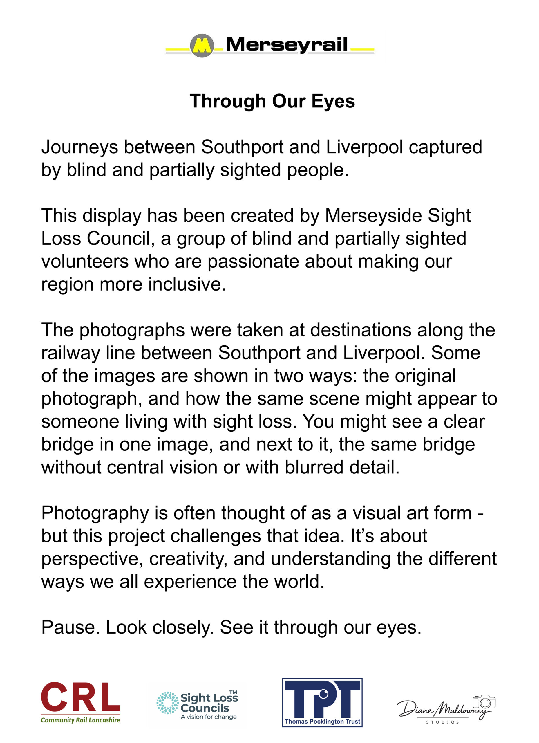
The exhibition description panel is a portrait-format board with a plain white background, creating strong contrast for readability. All text is printed in black, using a clear, modern sans-serif font. The layout is uncluttered and spacious, with generous line spacing and clear separation between sections.
Top section – branding
At the very top of the panel, centred horizontally, is the Merseyrail logo.
The logo consists of a yellow circular symbol containing a black capital letter “M”, positioned to the left of the word “Merseyrail” in bold black text. Thin yellow horizontal lines extend outward on either side of the circular symbol, visually anchoring the logo across the top of the panel.
Title and introduction
Below the logo, aligned to the left, is the exhibition title in large, bold black text:
‘Through Our Eyes’
Underneath the title is a short introductory sentence in regular black text: Journeys between Southport and Liverpool captured by blind and partially sighted people.
Main body text
The next section explains who created the exhibition:
“This display has been created by Merseyside Sight Loss Council, a group of blind and partially sighted volunteers who are passionate about making our region more inclusive.”
This is followed by a paragraph describing the photographs and how they are presented:
“The photographs were taken at destinations along the railway line between Southport and Liverpool. Each image is shown in two ways: the original photograph, and how the same scene might appear to someone living with sight loss. You might see a clear bridge in one image, and next to it, the same bridge without central vision or with blurred detail.”
The final paragraph reflects on the wider meaning of the project:
“Photography is often thought of as a visual art form – but this project challenges that idea. It’s about perspective, creativity, and understanding the different ways we all experience the world.”
The text concludes with a short, reflective call to action, set apart as its own line:
“Pause. Look closely. See it through our eyes.”
Bottom section – partner logos
Along the bottom of the panel is a horizontal row of partner and supporter logos, evenly spaced across the width of the board.
From left to right:
- Community Rail in Lancashire logo, featuring the initials “CRL” in bold red lettering, alongside a green “25” marking 25 years, with smaller green text underneath reading Community Rail in Lancashire 2001–2026.
- Community Rail Accreditation Partnership logo, showing a stylised group of people in orange above green text reading Community Rail Accreditation Partnership, with the year 2025–26 beneath.
- Sight Loss Councils logo, consisting of a teal circular dotted motif, with the words Sight Loss Councils in dark teal text and the strapline A vision for change underneath.
- Thomas Pocklington Trust logo, displayed as a bold blue rectangle containing the white letters “TPT”, with the charity’s full name below.
- Diane Muldowney Studios logo, shown in black and white, featuring a stylised camera icon above the words Diane Muldowney Studios.
Photo Panel One
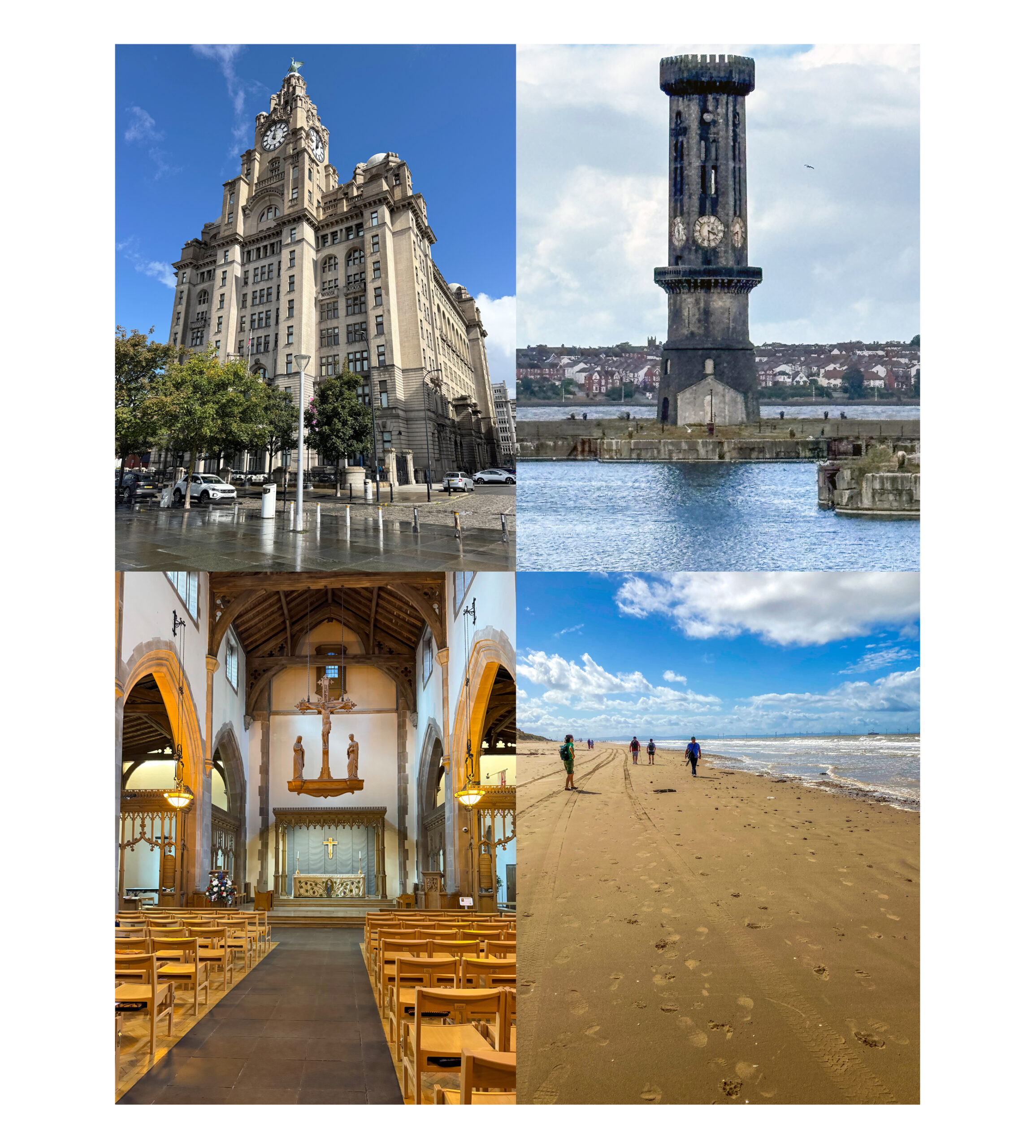
This photo panel is arranged as a four-image grid, showing a collection of scenes photographed by blind and partially sighted people. Together, the images capture architecture, landscape, interior space and movement, reflecting how place is experienced through atmosphere, structure and scale rather than purely visual detail.
Top left – The Royal Liver Building
The Royal Liver Building. This is a tall, historic stone building which dominates the scene, rising several storeys high with a large clock tower. The architecture is grand and formal, with layered stonework, arched windows and decorative detailing that draws the eye upward. At street level, the ground appears wet, suggesting recent rain, and the reflective surface subtly mirrors the building above. A few cars are parked nearby, and slender street bollards line the pavement. The sky is bright blue with scattered clouds, creating a strong contrast with the pale stone of the building.
Top right – Victoria Tower
Victoria Tower located in Salisbury Docks. This is an historic clock on a solitary hexagonal column stands between the docks and the river, its dark stone surface weathered by time and the elements. Six clock faces are set around the tower, each facing a different direction. The water around it is calm with gentle ripples. In the distance, a coastal town stretches along the shoreline, with rows of houses visible beneath a soft, pale sky. The image conveys isolation and stillness, with the tower acting as a fixed point against the wide, open seascape.
Bottom left – The Church of Our Lady and St. Nicholas
The Church of Our Lady and Saint Nicholas. The interior of this church is shown from the central aisle, looking directly towards the altar. Rows of light wooden chairs are neatly arranged on either side, creating a strong sense of symmetry and order. The space feels calm and reverent. Wooden beams arch overhead, and warm lighting highlights the textures of the stone walls and timber ceiling. At the far end, a simple altar sits beneath religious symbols, drawing the viewer’s attention forward along the aisle.
Bottom right – Crosby Beach
Crosby Beach. A wide sandy beach stretches into the distance, marked by footprints and parallel car tracks running along the shoreline. Several people are walking away from the camera, spaced out across the sand, giving a sense of scale and depth. The sea lies to the right, with small waves rolling in under a bright sky filled with scattered white clouds. The open horizon and expansive space create a feeling of freedom, movement and openness.
Overall impression
Together, the four photographs explore different ways of understanding space — through height, distance, texture, order and movement. The panel invites viewers to consider how blind and partially sighted photographers frame the world, focusing on structure, atmosphere and the emotional sense of a place rather than visual detail alone.
Photo Panel Two
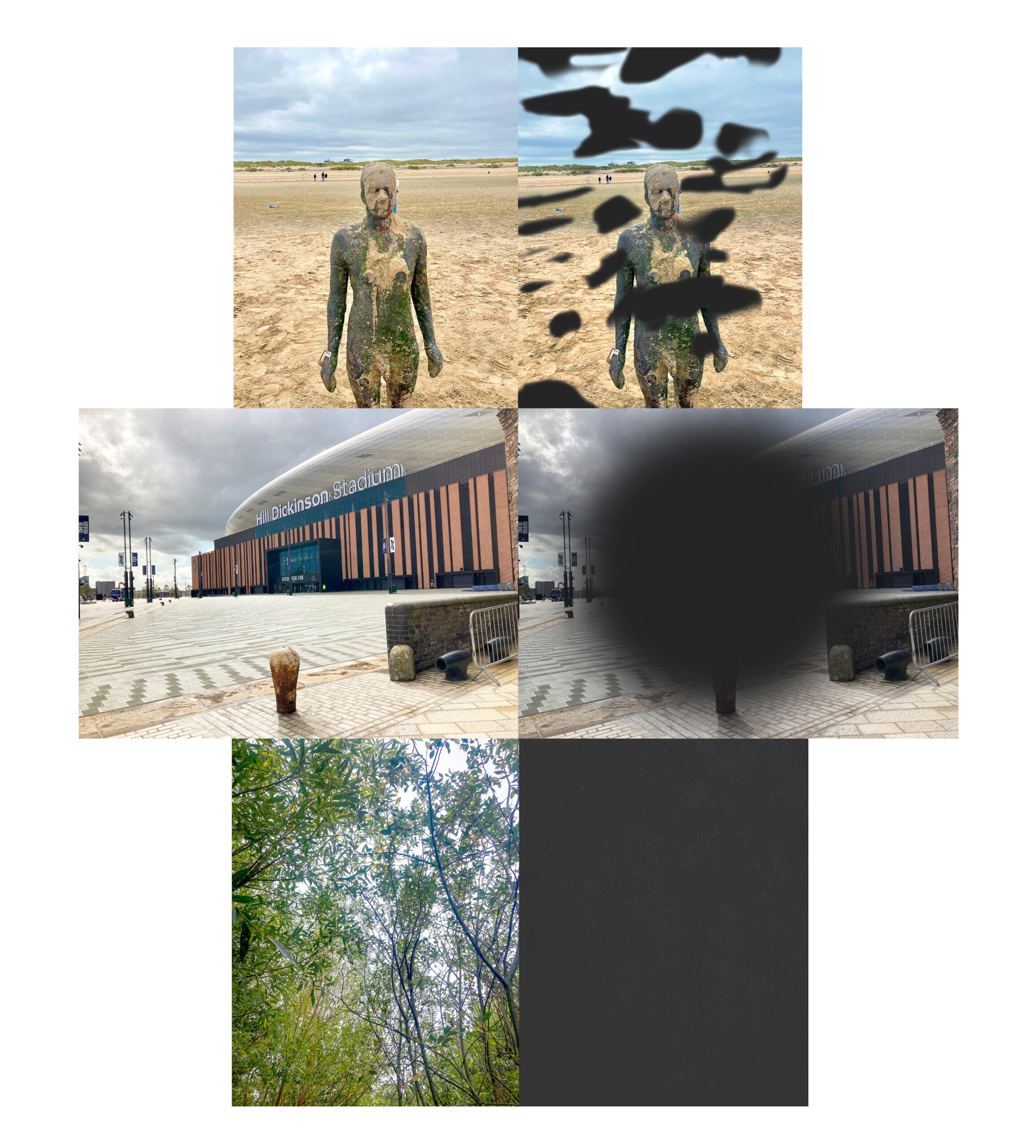
This exhibition panel is presented on a white background and arranged as a series of paired images, showing original photographs alongside altered versions that demonstrate how the same scenes may appear to someone living with sight loss. The images are organised in three horizontal rows, read from top to bottom.
Top row – Beach sculpture
Left image: Another Place sculpture, Crosby Beach. A photograph of a human-shaped sculpture standing on a wide, sandy beach. The sculpture appears life-sized and is facing directly towards the camera. Its surface is rough and uneven, covered in mottled textures of brown, grey, green and ochre, suggesting weathering, sea air and exposure to the elements. The sand stretches far into the distance, with a few tiny figures visible far behind the sculpture. Low sand dunes line the horizon. Above, the sky is pale grey and cloudy, giving the scene a quiet, slightly windswept feel.
Right image: The same scene, but with irregular dark shapes obscuring large areas of the image. These black patches float across the sky and over parts of the sculpture’s face and body, blocking details at random points. The beach and sculpture are still partially visible beneath the obscured areas. This altered image represents patchy or interrupted vision, where parts of a scene may disappear or be masked.
Middle row – Hill Dickinson Stadium
Left image: Hill Dickinson Stadium, Liverpool. The stadium building is large and modern, with vertical stripes of warm brown and darker panels. The name “Hill Dickinson Stadium” is visible high on the building’s curved façade. In the foreground is an open paved space with patterned paving stones, metal barriers, and short stone bollards. The sky is overcast, and the space feels open, exposed, and slightly stark.
Right image: The same scene, but with a large dark circular blur covering the centre of the photograph. The stadium name and central details are obscured, while parts of the building and pavement remain visible around the edges. This image represents loss of central vision, where objects directly ahead are difficult or impossible to see, even though peripheral vision remains.
Bottom row – Woodland Path
Left image: Formby Beach Woods. A view looking upward through a dense area of trees and branches. Slender trunks and thin branches criss-cross the image, covered in green leaves. Light filters through the foliage, creating a layered, textured scene of greens and browns. The perspective feels immersive, as though standing beneath the trees and looking up into the canopy.
Right image: A solid dark grey block with no visible detail. This blank image represents severe sight loss, where a scene may be entirely absent or unreadable.
Overall meaning
Together, these paired images show how familiar environments – beaches, public buildings, and natural spaces – can be experienced very differently depending on how someone sees. By placing clear photographs alongside obscured or blank versions, the panel invites viewers to reflect on how sight loss can affect detail, orientation, confidence, and connection to place.
Photo Panel Three
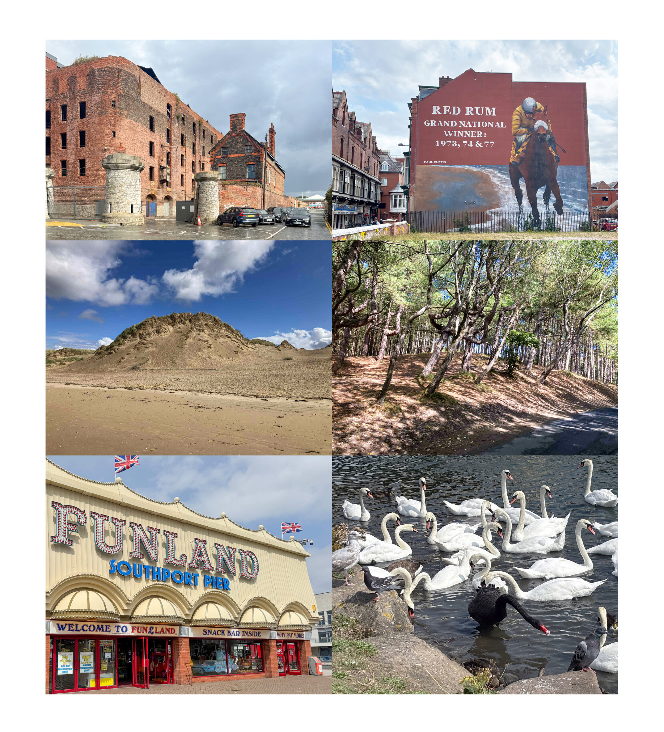
This exhibition panel is arranged in a neat grid of six colour photographs, set against a white background. The images are presented in three rows of two, showing a variety of locations and scenes along the route between Southport and Liverpool. Together, they capture a mix of urban landmarks, coastal paths, leisure spaces, and wildlife.
Top row
Top left: Tobacco Warehouse, Regent Road, Liverpool. A photograph of a large red brick building, which has been an old warehouse. The bricks are weathered, with darker patches suggesting age and exposure. In front of the building are two short, round stone towers or gateposts, and a small car park with several parked cars. The ground appears wet, reflecting light, suggesting recent rain. The sky above is grey and overcast, adding a slightly dramatic, moody atmosphere to the scene.
Top right: Red Rum Mural, Southport. A large wall mural painted on the side of a building. The mural shows a jockey riding a horse at speed. Large white lettering reads: “Red Rum, Grand National Winner, 1973, 74 & 77”. The painting celebrates the famous racehorse Red Rum and stands out boldly against the surrounding street of terraced buildings. The colours are strong and graphic, making the mural a striking focal point within the urban setting.
Middle row
Middle left: Crosby Beach. A tall, wind-shaped sand dune covered in grass dominates this image. A line marked with seaweed indicates the tide line dividing the smoother beach sand from the rougher sand at the foot of the dunes. Behind the dunes is a bright blue sky streaked with some white clouds. The scene feels open, fresh, and breezy.
Middle right: Formby Beach Woods. A woodland scene with the pale tree trunks clearly having been blown to grow leaning towards the left. There is a pathway showing on the bottom right edge. The light blue sky is glimpsed between the trees giving it a light, inviting impression.
Bottom row
Bottom left: The entrance to Funland, Southport Pier. The building façade is cream coloured with decorative arches. Large, colourful signage reads “Funland Southport Pier”, with smaller text below saying “Welcome to Funland” and “Snack Bar Inside” and “Why Pay More”. Union flags are flying above the building. The entrance doors are red, and the overall look is bright, cheerful, and nostalgic.
Bottom right: Marine Lake, Southport. A group of swans gathered at the edge of a body of water. Most of the swans are white, with long curved necks, while one black swan stands out clearly among them. The water is dark and gently rippling. Some swans are floating while others are close to the stone edge of the bank. The scene feels calm and natural, contrasting with the more built-up images elsewhere on the panel.
Overall impression
Together, these six images show the diversity of places and experiences along the Southport–Liverpool route, from historic buildings and bold public art to coastal paths, leisure spaces, seaside attractions, and quiet moments in nature. The panel highlights how familiar locations can be rich in texture, atmosphere, and memory, inviting viewers to reflect on how these spaces are seen, noticed, and experienced in different ways.
Photo Panel Four
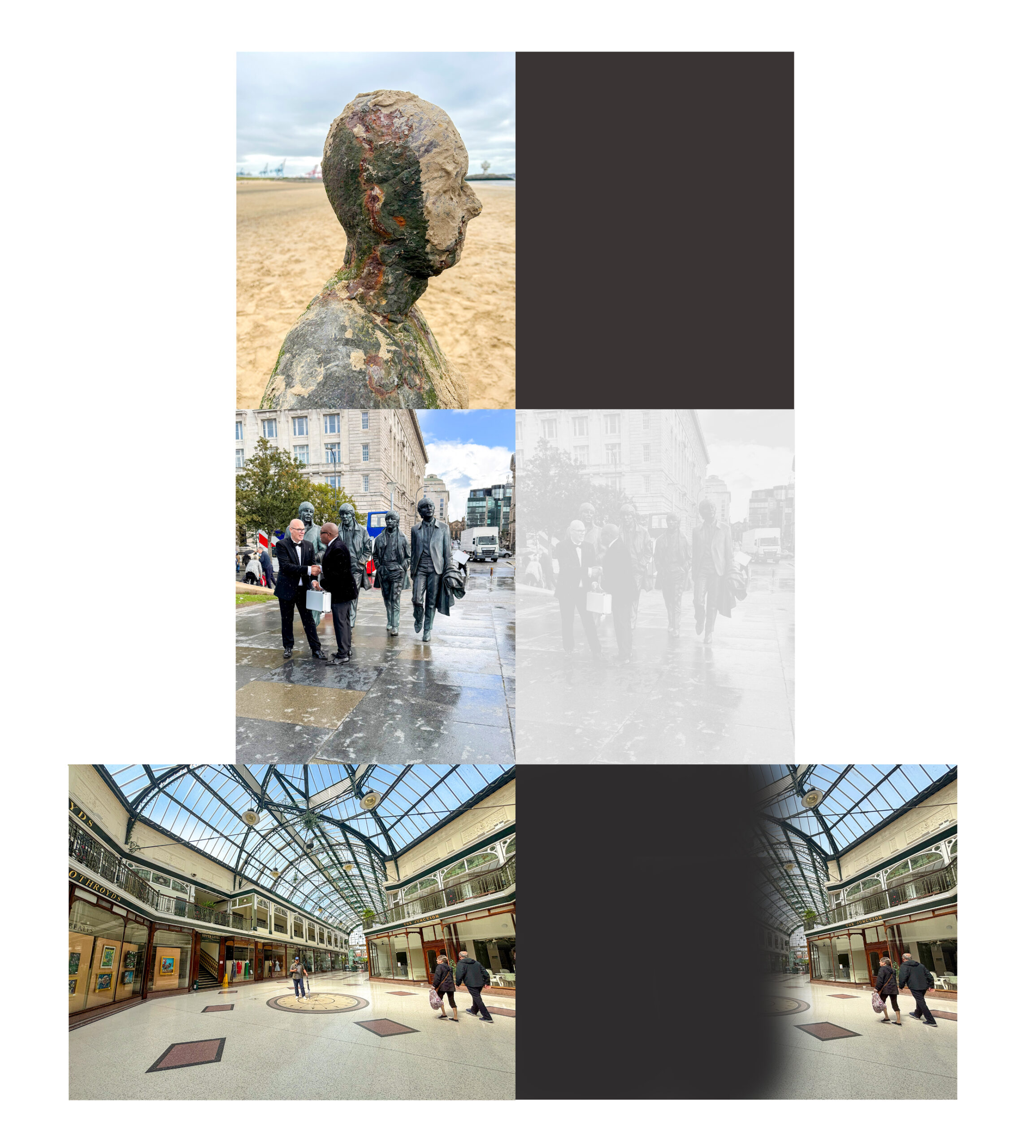
This panel is arranged in a grid-style layout on a white background, combining original photographs with edited versions that represent how the same scenes may appear to someone living with sight loss. The images are grouped in rows, with some images shown clearly and others partially obscured or faded to demonstrate different visual experiences.
Top Row – Another Place Sculpture
Top left: Another Place sculpture, Crosby Beach. At the top left of the panel is a photograph of a weathered sculptural figure, shown in side profile. The iron sculpture appears human-like, with a head and shoulders. Its surface is textured and mottled, with patches of earthy browns, greys, and hints of green, suggesting age and exposure to the elements.
The figure stands on a sandy beach, with flat, pale sand stretching into the distance. The sky above is light grey and overcast. The sculpture faces to the right, away from the viewer, giving a quiet, reflective feel to the image.
To the right of this photograph is a solid dark grey block, with no visible detail. This blank area represents severe sight loss, where parts of a scene may be completely missing from view.
Middle Row – The Beatles Statue
Middle left: The Beatles Statue by Pier Head. In the centre of the panel, on the left, is a street scene showing a group of four bronze statues of men walking together, placed on a city pavement. The figures are life-sized and dressed in formal clothing, including suits and coats. In front of the statues, two real people are standing and talking, one holding a small, white suitcase. The pavement appears wet, reflecting light, suggesting recent rain. Surrounding buildings rise in the background, and the scene feels busy and urban.
To the right of this image is a faded, low-contrast version of the same scene. The figures, buildings, and pavement are still visible, but they appear washed out and pale. Details are harder to distinguish, and edges blend into one another, illustrating how reduced contrast and clarity can affect how a scene is perceived.
Bottom Row – Wayfarers Arcade
Bottom left: Wayfarers Arcade, Lord Street, Southport. At the bottom of the panel is a wide photograph of a large indoor shopping arcade with a high, arched glass roof supported by dark metal framework. The floor is pale and polished, with decorative geometric patterns set into it. Shops line both sides of the arcade, and several people are walking through the space.
On the right-hand side of this image is an altered version of the same scene. A large dark blur obscures left hand side of the photograph, blocking much of the detail. Only the right side of the arcade remain clearly visible. This effect represents loss of one-sided vision where objects on one side may be difficult or impossible to see, even though the opposite side vision remains.
Overall meaning
Together, these images show how the same places can be experienced very differently depending on how someone sees the world. By pairing clear photographs with altered versions, the panel invites viewers to reflect on how sight loss can change perception, navigation, and understanding of everyday environments — from open outdoor spaces to busy city streets, to large indoor public buildings.
Photo Panel Five
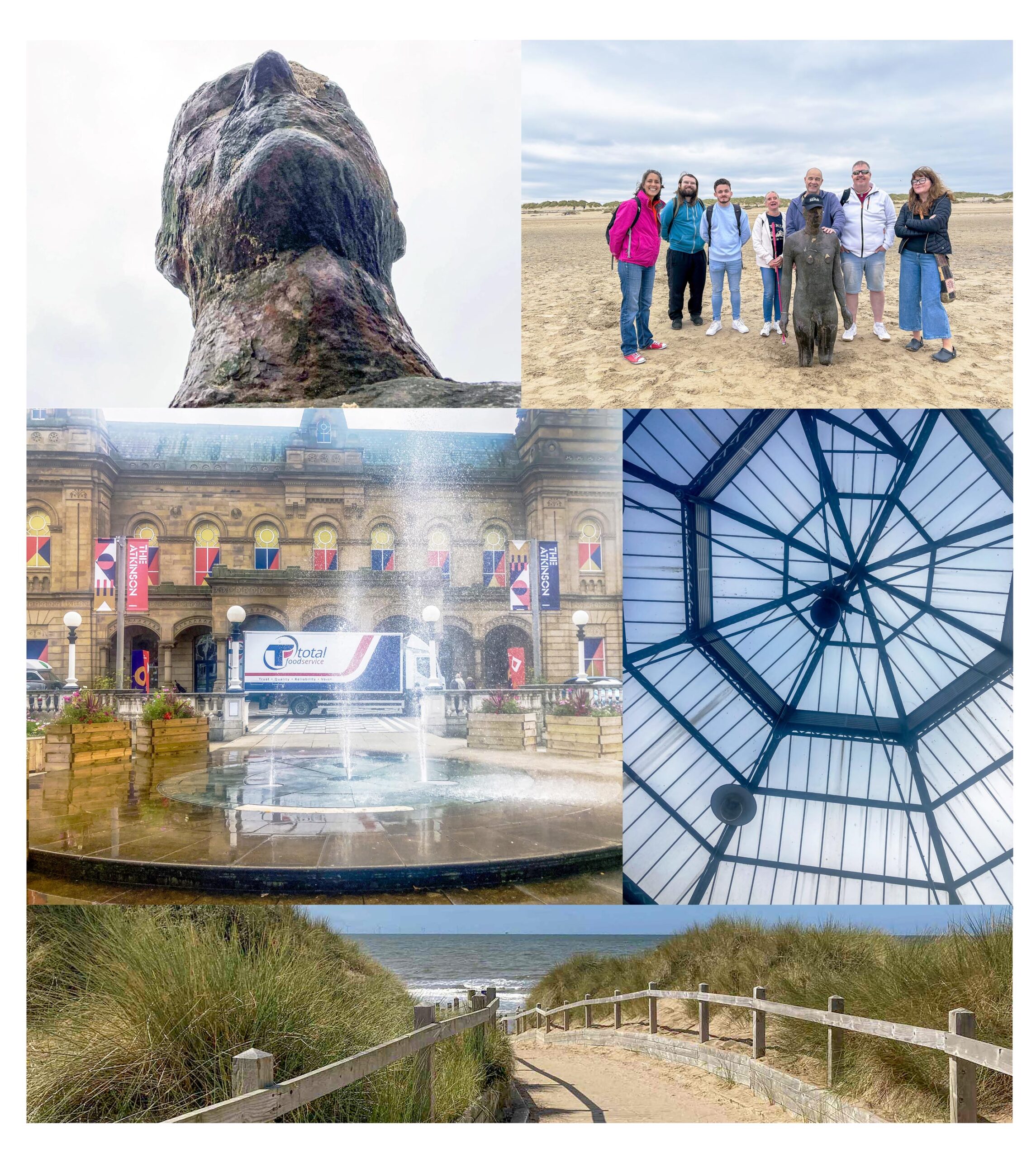
This exhibition panel is presented on a white background and arranged as a collage of photographs, showing people, places, and perspectives connected to the coastal and urban environments explored in the project. The images are laid out in rows and vary in scale, combining close-up details with wider group scenes.
Top row
Top left: Another Place sculpture, Crosby Beach. A close-up photograph of the upper head and shoulders of a weathered human-shaped sculpture, viewed from behind and slightly below. The sculpture’s surface is rough and uneven, with mottled colours including greys, browns, greens, and darker patches, suggesting age and exposure to the elements. The sky behind it is pale and overcast, giving the image a quiet, reflective mood.
Top right: Another Place sculpture, Crosby Beach. A group of seven people standing on a sandy beach, gathered around the same human-shaped sculpture. The sculpture stands at the centre, reaching roughly waist height on the adults. The group includes men and women dressed casually in jackets, jeans, and trainers, suitable for an outdoor coastal setting. Some are smiling, others standing relaxed with hands by their sides or in pockets. Behind them, the wide beach stretches out towards low dunes under a cloudy sky. The image conveys a sense of shared experience and connection.
Middle row
Middle left: The Atkinson, Southport. A photograph of a public square with a circular fountain in the foreground. Water sprays upwards from the centre of the fountain, creating fine mist and ripples across the wet stone surface. In the background is a large historic building with arched windows and decorative stonework. Colourful vertical banners hang from the building’s façade. A delivery lorry is parked beyond the fountain, and planters frame the edges of the square. The ground reflects light, suggesting recent rain.
Middle right: Wayfarers Arcade, Southport. An upward-looking photograph of a large glass roof, inside the covered arcade. Dark metal beams form a geometric pattern of intersecting lines, creating triangular and diamond shapes. The glass panels allow pale daylight to filter through, giving the image a structured, architectural feel and drawing attention to pattern, symmetry, and contrast.
Bottom row
Bottom image (full width): Crosby Beach. A sandy coastal path leading towards the sea. The path is bordered by wooden railings on both sides and flanked by wind-shaped sand dunes covered in long grass. The path gently curves forward, drawing the eye towards the horizon. Beyond the dunes, the sea is visible, with small waves under a bright blue sky streaked with thin white clouds. The scene feels open, fresh, and breezy.
Overall meaning
This panel brings together people, place, and perspective. It shows moments of shared exploration alongside close observation of texture, space, and structure. By combining intimate details, architectural viewpoints, and wide-open landscapes, the images reflect how environments can be experienced collectively and individually, encouraging viewers to think about how different perspectives shape our understanding of the same places.