Bus Stop Signage
In November 2018, Birmingham Sight Loss Council began to work with West Midlands Combined Authority to improve bus stop signage in the local area.
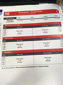
We identified that bus timetables and signage were not very readable for those with low vision. In particular, members highlighted that the colour contrast of dark blue and white were hard to read, and the layout of the timetable information, with text very close together and poorly spaced meant it was inaccessible for those with lower vision to follow and understand the timetables. Thus making it difficult for people to travel without support.
The West Midlands Combined Authority were approached and they were keen to collaborate and make improvements. Meetings were held and new designs were tested and put in place.
The Sight Loss Council were enthusiastic about the new designs which are much clearer, contain larger text and better colour contrast, which resulted in people with low vision being able to identify the correct bus numbers and times. The council members were pleased to have their voice heard and contribute to the design of the new timetables and signage, and very much looking forward to working with other providers in the future.
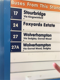
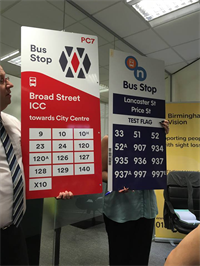
Below images show a comparison of the old and new bus stop signs.
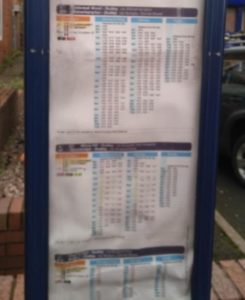
Below images show a comparison of the old and new bus timetables.
Do you have issues with inaccessible travel?
Publication date: 15 October 2020